
As the founder of MLTUT, I’ve spent years sharing tutorials on machine learning and data science. A question that I often get from people is: Is Python good for data visualization? This is something I’ve explored deeply through my work and studies, and today, I’m excited to share my personal journey with Python and how it became my go-to tool for visualizing data.
In this blog, I will cover my own experiences with Python, the challenges I faced, how I overcame them, and the tools that I used. If you’re a beginner or someone curious about how Python fits into data visualization, I hope my story and insights will help you make an informed decision.
So, without any further ado, let’s get started-
Is Python Good for Data Visualization?
- Why I Chose Python for Data Visualization
- My Early Struggles with Data Visualization
- Why Python Stood Out for Me
- My Journey: From Basic Plots to Advanced Visualizations
- Python Libraries That Made a Difference
- Common Challenges and How to Overcome Them
- How Python Improved My Workflow
- Comparing Python with Other Data Visualization Tools
- Is Python Right for You?
- Simple Data Visualization with Python
- My Final Thoughts on Python for Data Visualization
- What’s Next?
- Resources to Learn Data Visualization Using Python
- Conclusion
Why I Chose Python for Data Visualization
My Background
When I first started working on machine learning projects, I quickly realized how important data visualization was. I needed to understand my data, show trends, and communicate insights to others. Initially, I tried using Excel and other drag-and-drop tools, but these didn’t give me the flexibility I wanted.
Since I was already using Python for my machine learning models, I wondered: Could I use Python for data visualization as well? I dove into it, and I haven’t looked back since.
My Early Struggles with Data Visualization
The Steep Learning Curve
When I first started with data visualization, I used Excel because it was easy for creating basic charts. However, as my projects became more complex, I felt limited. I needed something that could handle more sophisticated visualizations. That’s when I decided to explore Python.
Too Many Choices
Python has many libraries for data visualization, like Matplotlib, Seaborn, Plotly, and Bokeh. It was confusing at first because I didn’t know which one to start with or which would be best for my projects. But over time, I figured out what worked for me.
Why Python Stood Out for Me
Seamless Integration with Machine Learning
Since I was already using Python for data analysis and machine learning, using it for data visualization made my workflow smooth. I didn’t have to switch between different software. With Python, I could clean and analyze my data, then visualize it all in one place.
Flexibility and Control
One thing I love about Python is that it gives you full control over your visualizations. You can customize everything—from the color and style of your plots to the labels and scales. This was a huge advantage for me because I often needed detailed, specific visualizations for my projects.
Strong Community Support
Python has a huge community, and it’s open-source, which means that if you run into issues, there are plenty of resources like tutorials, forums, and blogs to help you out. This made learning Python for data visualization much easier.
My Journey: From Basic Plots to Advanced Visualizations
Starting with Matplotlib
When I first started learning Python, Matplotlib was my go-to library for creating basic plots. It’s one of the most popular and widely used tools for data visualization in Python. Matplotlib is great for making simple, static visualizations like bar charts, line graphs, and scatter plots.
This is an example of a basic line plot using Matplotlib:
import matplotlib.pyplot as plt

# Sample data
x = [1, 2, 3, 4, 5]
y = [10, 20, 25, 30, 40]

# Simple line plot
plt.plot(x, y)
plt.xlabel('X-axis')
plt.ylabel('Y-axis')
plt.title('Basic Line Plot')
plt.show()
Challenges I Faced: Initially, I struggled with making my plots look more professional. Customizing things like labels, colors, and plot sizes felt a bit overwhelming. The syntax wasn’t very intuitive for me, and I found myself spending a lot of time checking the documentation.
What Helped Me: I found Matplotlib’s online gallery really helpful. It has tons of examples, and by copying and tweaking them, I was able to slowly understand how things work. Practicing regularly made it easier for me to get comfortable with the syntax, and I could eventually customize plots to suit my needs.
Making My Visuals Prettier with Seaborn
After getting comfortable with Matplotlib, I wanted my charts to look more visually appealing and polished. That’s when I discovered Seaborn, a library built on top of Matplotlib. Seaborn makes it easier to create beautiful and informative statistical plots.
This is an example of a scatter plot using Seaborn:
import seaborn as sns
import matplotlib.pyplot as plt

# Load dataset
data = sns.load_dataset('tips')

# Create a scatter plot
sns.scatterplot(data=data, x='total_bill', y='tip', hue='day')
plt.title('Total Bill vs Tip')
plt.show()
Why I Switched to Seaborn: Seaborn’s default settings give plots a polished, modern look without much effort. Plus, the syntax is easier to use, and you can add colors or statistical elements like regression lines quickly. This helped me save time when I needed good-looking charts for presentations or reports.
Challenges I Encountered: While Seaborn made my visuals prettier, I still needed to use Matplotlib for more advanced customizations. It took me some time to figure out how to mix Seaborn’s simplicity with Matplotlib’s flexibility.
What Helped Me: Exploring the documentation and experimenting with Seaborn’s built-in datasets (like the tips dataset) was a big help. I learned a lot by trying out different plot types and adjusting the parameters to fit my data better.
Creating Interactive Visualizations with Plotly
As I gained confidence, I wanted to create interactive visualizations that allowed users to zoom in, hover over data points, and explore the data. That’s when I found Plotly, a powerful library for creating interactive and dynamic plots.
This is an example of an interactive scatter plot with Plotly:
import plotly.express as px

# Load dataset
df = px.data.iris()

# Create an interactive scatter plot
fig = px.scatter(df, x='sepal_width', y='sepal_length', color='species')
fig.show()
Why Plotly Stood Out for Me: Plotly was a game-changer for creating visualizations where people could interact with the data. This was especially useful for my research presentations, where I needed to showcase trends in a more dynamic and engaging way.
Challenges I Faced: The challenge with Plotly was learning how to fully take advantage of its features. There were so many options for customization and interactivity, and it took some time to figure out how to use them effectively.
What Helped Me: Plotly’s documentation and online tutorials made learning a lot easier. The community is also very active, and I found plenty of examples and walkthroughs to help me build more interactive and insightful visualizations.
Exploring Advanced Visualizations
As I became more experienced, I started experimenting with advanced visualization techniques to solve specific problems, such as visualizing time series data or geospatial information.
- Time Series Plots: For analyzing trends over time, I used Pandas along with Matplotlib to create time series plots with moving averages and trend lines.
- Geospatial Visualizations: For maps and location-based data, I turned to Folium and GeoPandas, which let me create interactive maps and show geographic patterns.
Challenges I Faced: Each type of visualization came with its own set of hurdles. Working with time series data required a solid understanding of date-time formats, while geospatial visualizations required me to learn about map projections and geographic data formats like shapefiles.
What Helped Me: I took things step by step, starting with simple datasets and gradually working my way up to more complex ones. Attending webinars and taking online courses also helped me grasp these advanced topics faster.
Building Dashboards with Python
Eventually, I wanted to go beyond individual plots and create interactive dashboards to showcase all of my findings in one place. This led me to discover Dash, a library built on Plotly that allows you to create web-based dashboards using Python.
Challenges I Faced: Building dashboards was more complex than I expected. Dash required me to not only know Plotly but also understand how to structure a web app using Python. It took me some time to grasp the layout structure and callback functions.
What Helped Me: Again, the documentation and community examples played a crucial role. I started by building small, simple dashboards and then gradually added more complex features as I became more comfortable with the framework. Eventually, I was able to create professional-looking dashboards for both research and consulting projects.
Summary of My Journey:
- Matplotlib: Helped me get started with basic plots but took time to master.
- Seaborn: Made my visuals more appealing and easier to create, but still needed Matplotlib for more customization.
- Plotly: Allowed me to create interactive visualizations that added a dynamic element to my presentations.
- Dash: Took me to the next level by enabling me to build interactive dashboards.
Python, with its variety of libraries, allowed me to grow from creating simple static plots to building advanced interactive visualizations and dashboards. Each tool has its strengths, and learning them step by step made my journey enjoyable and rewarding.
Python Libraries That Made a Difference
1. Matplotlib
- What it’s good for: Simple, static plots like line graphs, bar charts, and pie charts.
- Why I like it: It’s highly customizable and the go-to library for many other Python visualization tools.
2. Seaborn
- What it’s good for: Statistical plots such as heatmaps, violin plots, and pair plots.
- Why I like it: It’s built on Matplotlib but makes it easier to create professional-looking visualizations.
3. Plotly
- What it’s good for: Interactive plots that allow users to explore the data.
- Why I like it: It’s perfect for creating dashboards and interactive charts, making data exploration easier.
4. Pandas Built-in Plotting
- What it’s good for: Quick visualizations directly from Pandas DataFrames.
- Why I like it: It’s fast and convenient when you’re already using Pandas for data analysis.
Common Challenges and How to Overcome Them
1. Setting Up Python for Data Visualization
- Challenge: Installing libraries and setting everything up can feel overwhelming, especially for beginners. You might wonder which tools you need or how to make them work together.
- Solution: To make things easier, I suggest using Anaconda or Jupyter Notebooks. These tools handle most of the setup for you and help manage the libraries without much hassle. Anaconda comes with many useful libraries, and Jupyter Notebooks let you see your code and visualizations in one place, making everything more interactive and beginner-friendly.
2. Choosing the Right Library
- Challenge: With so many libraries available (like Matplotlib, Seaborn, Plotly, etc.), it’s easy to feel confused about which one to pick.
- Solution: Start with the basics! Use Matplotlib or Seaborn for simple visualizations. Once you’re comfortable, you can explore libraries like Plotly for interactive plots or Bokeh for dynamic visuals. Don’t worry about trying all the tools at once—focus on one and expand later as needed.
3. Customization
- Challenge: Customizing plots (changing colors, labels, or styles) can feel tricky, especially when you’re using Matplotlib. The process isn’t always straightforward and may take some time to figure out.
- Solution: The best approach is to start by looking at examples and documentation. While it might feel frustrating at first, practice makes it easier. Seaborn simplifies some customizations, and once you get the hang of it, making changes in Matplotlib won’t feel as difficult.
4. Managing Large Datasets
- Challenge: Visualizing large datasets can be slow, and sometimes your computer might freeze or the plot takes too long to display.
- Solution: To deal with large data, try working with smaller samples first. You can also use tools like Dask to process data in smaller chunks. For better performance with big datasets, Plotly and Bokeh handle this more efficiently, especially when creating interactive plots where you can zoom and pan.
5. Understanding the Documentation
- Challenge: The official documentation for libraries like Matplotlib or Plotly can be hard to follow, especially if you’re just starting out. It’s easy to get stuck when the examples don’t match what you’re trying to do.
- Solution: Use community resources like Stack Overflow, GitHub, and tutorial sites. You’ll find plenty of helpful answers and examples that are easier to understand. Start with basic tutorials and slowly move on to more advanced examples.
6. Integration with Other Tools
- Challenge: Exporting your visualizations to use in presentations, reports, or websites can be tricky. Keeping the quality high or making sure the visualizations work properly in different formats can be frustrating.
- Solution: Use Matplotlib’s
savefig()to export your visualizations in high-quality formats like PNG or PDF. For interactive plots, Plotly allows you to save them as HTML files, keeping the interactivity when you share them with others.
7. Handling Interactive Visualizations
- Challenge: Creating static plots is easy, but making interactive visualizations can add extra complexity. It gets even trickier if you want to embed them on websites or apps.
- Solution: If you’re interested in interactive visuals, Plotly and Bokeh are great options. They have built-in features that make embedding easy. For more advanced projects, consider learning Dash (built on Plotly) to create web applications with interactive charts and graphs. You can find many beginner-friendly tutorials to guide you.
8. Debugging Visualizations
- Challenge: Sometimes, your plot might not look right—whether it’s missing labels, wrong data points, or other errors. Figuring out what went wrong can take a lot of time.
- Solution: Take it step by step. Start by creating a simple plot without any customization. Then, add features one at a time (like labels or colors). This will help you identify where things go wrong. Using Jupyter Notebooks also helps because you can see each part of the output as you go, making it easier to catch mistakes.
9. Combining Multiple Plots
- Challenge: Creating multiple plots in a single figure (such as subplots) can feel confusing, especially when adjusting the layout or making sure everything looks neat.
- Solution: Use the subplot feature in Matplotlib. Start by plotting simple subplots and slowly adjust them as you get more comfortable. There are many tutorials and examples online that can guide you through the process step by step.
How Python Improved My Workflow
Efficiency in My Projects
Using Python for data manipulation, analysis, and visualization all in one place saved me a lot of time. I didn’t have to export data from one tool and import it into another. Everything I needed was in Python, which made my workflow much smoother.
A Real-World Example: My PhD Research
In my PhD research on depression detection from social media, visualizing the data was a crucial step. Python libraries like Matplotlib, Seaborn, and Plotly helped me analyze large amounts of data and uncover patterns related to mental health. These insights were key in building machine learning models that could detect signs of depression in social media text.
Comparing Python with Other Data Visualization Tools
When you want to visualize data, there are many tools out there, each with its own pros and cons. In this section, I’ll compare Python with three popular tools: Excel, Tableau, and Power BI. Knowing their differences can help you pick the right one for your needs.
Python vs. Excel
- Ease of Use:
- Excel: Excel is super popular because it’s easy to use. You can quickly create basic charts and graphs by just selecting your data and picking a chart type. This makes it great for beginners who need to visualize data fast.
- Python: Python requires some coding knowledge. You have to write code to create visualizations, which might be tough for people new to programming. However, once you learn the basics, Python’s flexibility is a huge benefit.
- Types of Visualizations:
- Excel: Excel is perfect for simple visualizations like bar charts, line graphs, and pie charts. But it struggles when you want to make more complex or custom plots. It can slow down or even freeze with large datasets.
- Python: Python shines when it comes to advanced and customizable visualizations. With libraries like Matplotlib, Seaborn, and Plotly, you can create a wide range of plots, including interactive ones. This is especially helpful for large datasets or detailed insights.
- Interactivity:
- Excel: Excel has some interactive features like slicers and filters, but they’re pretty basic compared to what you can do with Python.
- Python: With libraries like Plotly and Dash, Python lets you create very interactive visualizations. Users can zoom in, hover over data points for more info, and even manipulate data in real time. This makes presentations and reports much more engaging.
- Automation and Integration:
- Excel: Excel is mainly a standalone tool, so it’s not great for automation. You can use macros, but they can be tricky for larger projects.
- Python: Python makes it easy to automate tasks and connect with other tools and data sources. You can write scripts to automatically generate visualizations, making it simple to update reports or dashboards with new data.
Excel is great for quick and simple visualizations, but Python is better for advanced and customizable options. If you’re dealing with detailed analysis and large datasets, Python is the way to go, especially if you’re comfortable with coding.
Python vs. Tableau
- User-Friendliness:
- Tableau: Tableau is all about user experience. Its drag-and-drop interface allows you to create complex visualizations without any coding. This is perfect for people who want to focus on data analysis instead of programming.
- Python: Python does require coding, which can be a bit scary for those who aren’t used to it. But for those willing to learn, Python offers much more flexibility and customization.
- Customization:
- Tableau: Tableau has built-in templates and styles that make it easy to create attractive dashboards. However, it can be limiting when you want to customize specific parts of your visualizations.
- Python: With Python, you can control every detail of your visualizations. You can customize everything from colors and labels to the overall layout. This is especially useful if you have specific branding guidelines.
- Cost:
- Tableau: Tableau is a paid tool, which means you have to pay licensing fees. This can be tough for individuals or small businesses on a budget.
- Python: Python is free to use, which makes it a great option for individuals and organizations. You can take advantage of powerful libraries without any cost.
- Integration with Data Analysis:
- Tableau: Tableau is mostly a visualization tool. You often need to prepare your data separately. While it connects to various data sources, it doesn’t offer the same data manipulation capabilities as Python.
- Python: Python is great for data manipulation with libraries like Pandas and NumPy. You can clean, analyze, and visualize your data all in one place, making your workflow smoother and saving you time.
Tableau is fantastic for those who want a quick, easy tool to create dashboards. However, if you want full control over your visualizations and advanced customization, Python is the better choice, especially if you’re already using it for data analysis.
Python vs. Power BI
- Ease of Use:
- Power BI: Power BI is designed for business users. Its intuitive drag-and-drop interface makes it easy to create dashboards without coding skills, making it accessible to a wider audience.
- Python: Python requires some coding knowledge, which can be daunting for beginners. But once you get used to it, you’ll find that the coding aspect gives you much more flexibility and control.
- Data Handling:
- Power BI: Power BI handles large datasets well and lets you connect to various data sources, including databases and cloud services. It also has built-in tools for cleaning and transforming data.
- Python: Python also excels at handling data, especially with libraries like Pandas and NumPy. You can perform complex data manipulations before visualizing it, which is great if you need specific analyses before creating your plots.
- Interactivity:
- Power BI: Power BI offers a high level of interactivity. You can create dashboards with clickable elements that let users explore the data further. This is particularly useful for business presentations.
- Python: Python can also create interactive visualizations with libraries like Plotly and Dash. You can add hover effects, zoom capabilities, and filters to your plots, making them engaging and interactive.
- Cost:
- Power BI: Power BI has a free version with limited features, but for full functionality, you need a subscription. This can get expensive for businesses, especially for larger teams.
- Python: Python is completely free, making it a cost-effective option for individuals and organizations alike. You can use it without worrying about subscription fees.
- Integration:
- Power BI: Power BI integrates well with Microsoft products like Excel, making it a good choice for organizations that already use Microsoft tools.
- Python: Python is versatile and can integrate with many databases, web apps, and other programming languages, giving you the freedom to build a custom workflow.
Power BI is a great option for business users who want an easy-to-use tool for creating interactive dashboards quickly. However, if you need more flexibility, advanced customization, and data analysis capabilities, Python is the better choice, especially if you’re comfortable with coding.
Is Python Right for You?
Deciding whether Python is the right tool for your data visualization needs can feel overwhelming, but asking yourself a few simple questions can help you find the right answer. Let’s break it down:
1. Do You Already Use Python for Data Analysis or Machine Learning?
- Yes: If you already use Python for analyzing data or building machine learning models, adding Python for visualizations will be easy. Python works well with popular libraries like Pandas and NumPy, so you can smoothly move from analyzing your data to creating visuals without changing tools.
- No: If you’re new to Python, there might be a bit of a learning curve. However, learning Python can be very rewarding, especially if you’re interested in data analysis or machine learning. It’s a useful skill that many employers look for!
2. Do You Want Flexibility and Customization?
- Yes: If you want complete control over how your visuals look, Python is a fantastic choice. You can change everything from colors and labels to the types of charts you create. This is especially helpful if you need to work with complex data or if you have specific design needs, like following brand guidelines.
- No: If you prefer to use ready-made designs and don’t need a lot of customization, tools like Tableau or Power BI might be easier for you. These tools come with many templates and styles, allowing you to create nice visuals quickly without much fuss.
3. Do You Prefer Coding or Drag-and-Drop Interfaces?
- Coding Preference: If you enjoy coding and like the idea of writing scripts, Python will be exciting for you! You’ll get to build your visuals from the ground up, which can be fun and rewarding. Plus, learning Python can boost your analytical skills and open up new opportunities in data science.
- Visual Preference: If you like a more visual approach where you can drag and drop elements, tools like Tableau or Power BI might suit you better. These platforms are user-friendly and allow you to create interactive dashboards quickly without needing to know how to code.
Additional Considerations
- Project Complexity: Think about the complexity of your projects. If you often work with large datasets or need advanced visuals (like interactive graphs or detailed charts), Python’s features can really enhance your work.
- Future Goals: Consider what you want to achieve in data analysis or data science. If you aim to improve your technical skills and take on more challenging projects, learning Python will be very helpful. However, if you just need quick results for business reports, a more visual tool might be all you need.
- Community and Resources: Python has a large community and plenty of online resources, making it easier to find help when you need it. If you run into problems, there are many forums, tutorials, and courses to support your learning journey.
By reflecting on these questions, you can figure out if Python is the right fit for your data visualization needs. Choosing the right tool will make your work easier and more enjoyable!
Simple Data Visualization with Python
In this section, I’ll walk you through a basic example of data visualization using Python. Specifically, we’ll be using the Matplotlib and Seaborn libraries to create a simple line plot and a bar plot. These visualizations are essential for presenting data clearly and effectively.
Getting Started
Before we start coding, it’s important to ensure you have the necessary libraries installed. You can easily do this by running the following command in your terminal or command prompt:
pip install matplotlib seaborn
Example Code
This is a simple code snippet that demonstrates how to visualize data using Python:
import matplotlib.pyplot as plt
import seaborn as sns
import pandas as pd

# Sample Data
data = {
    'Year': [2018, 2019, 2020, 2021, 2022],
    'Sales': [200, 300, 400, 500, 600]
}

# Create a DataFrame
df = pd.DataFrame(data)

# Line Plot
plt.figure(figsize=(10, 5))
plt.plot(df['Year'], df['Sales'], marker='o', linestyle='-', color='b', label='Sales')
plt.title('Sales Over Years')
plt.xlabel('Year')
plt.ylabel('Sales')
plt.xticks(df['Year'])  # Set x-ticks to years
plt.grid()
plt.legend()
plt.show()

# Bar Plot using Seaborn
plt.figure(figsize=(10, 5))
sns.barplot(x='Year', y='Sales', data=df, palette='viridis')
plt.title('Sales Bar Chart')
plt.xlabel('Year')
plt.ylabel('Sales')
plt.show()
What We Did in the Code
- Import Libraries:
- We started by importing the necessary libraries: Matplotlib for plotting, Seaborn for enhancing the visuals, and Pandas for handling our data.
- Create Sample Data:
- We defined a simple dataset that contains sales figures for different years, stored in a dictionary format.
- Convert Data to DataFrame:
- We converted the dictionary into a Pandas DataFrame, which makes it easy to manipulate and visualize our data.
- Create a Line Plot:
- We set the size of the figure to 10 by 5 inches.
- We plotted the data, using years on the x-axis and sales on the y-axis. We added markers, lines, and a label for clarity.
- We gave the plot a title, labeled the axes, and set the x-ticks to show the years.
- We added a grid for better readability and displayed the legend to identify the line.
- Create a Bar Plot:
- We created another figure for the bar plot.
- We used Seaborn’s
barplot()function to display the sales data as a bar chart, using a vibrant color palette. - We titled this plot and labeled the axes as well, before displaying the bar chart.
Output
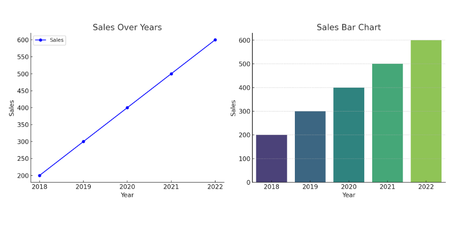
There are two simple plots made with Python that show what you can learn about data visualization:
Bar Plot: This bar chart clearly compares sales for different years, visually highlighting the sales amounts.
Line Plot: This plot displays sales figures over the years, making it easy to spot the trend of rising sales.
In this example, we explored how to visualize sales data over the years using Python. By using Matplotlib and Seaborn, we can create effective visualizations that help in understanding trends and patterns in data. With just a few lines of code, you can turn your data into engaging visual stories! Feel free to experiment with different datasets and customization options to enhance your visualizations further.
My Final Thoughts on Python for Data Visualization
In my experience, Python is a fantastic tool for data visualization, especially if you’re already using it for data analysis or machine learning. It offers flexibility, a wide range of libraries, and the ability to create both simple and advanced visualizations. The learning curve can be steep, but once you get the hang of it, Python opens up a world of possibilities.
I encourage anyone interested in data visualization to give Python a try. It’s a powerful, versatile tool that can grow with you as your skills advance. And with so many resources and a strong community, you’ll never feel lost in your learning journey.
What’s Next?
If you’re just starting out, I recommend exploring Matplotlib or Seaborn first. Play around with simple plots and then gradually move to more advanced libraries like Plotly. The more you practice, the more confident you’ll become in using Python for data visualization.
Resources to Learn Data Visualization Using Python
- Data Visualization–DataCamp
- Data Visualization– Coursera
- Understanding and Visualizing Data with Python– Coursera
- Data Visualization in Python Masterclass™ for Data Scientist– Udemy
- Data Visualization with Matplotlib for beginners– YouTube
I hope now you understand “Is Python Good for Data Visualization?”. Now, it’s time to wrap up this article.
Conclusion
In this article, I aim to answer your question: Is Python good for data visualization? I hope this guide helps you get started on your journey. If you have any doubts or questions, don’t hesitate to ask me in the comment section!
All the Best!
Enjoy Learning!
You May Also Be Interested In
10 Best Online Courses for Data Science with R Programming
8 Best Free Online Data Analytics Courses You Must Know in 2026
Data Analyst Online Certification to Become a Successful Data Analyst
8 Best Books on Data Science with Python You Must Read in 2026
14 Best+Free Data Science with Python Courses Online- [Bestseller 2026]
10 Best Online Courses for Data Science with R Programming in 2026
8 Best Data Engineering Courses Online- Complete List of Resources
Thank YOU!
To explore More about Data Science, Visit Here
Though of the Day…
‘ It’s what you learn after you know it all that counts.’
– John Wooden

Written By Aqsa Zafar
Aqsa Zafar is a Ph.D. scholar in Machine Learning at Dayananda Sagar University, specializing in Natural Language Processing and Deep Learning. She has published research in AI applications for mental health and actively shares insights on data science, machine learning, and generative AI through MLTUT. With a strong background in computer science (B.Tech and M.Tech), Aqsa combines academic expertise with practical experience to help learners and professionals understand and apply AI in real-world scenarios.